Brand
Download the wordmark, copy a hex, and change nothing.
Files, colour values and type settings for anyone putting Kit on a page: a partner's blog post, a conference slide, a press piece, an agent's prompt.
Wordmark and mark
Two files carry the whole identity: the lowercase wordmark and the plum mark. Every download here is the shipped path, untouched.

Wordmark, ink
On light surfaces. Lowercase, "startup" regular and "kit" bold, one path.

Wordmark, white
On dark surfaces and photographs. Same path, white fill.
The checkerboard shows transparency. It is not in the files.

Mark
The only flat vector of the mark: #fafafc letters on plum. Use it where the wordmark would be too small.


Avatar
The mark padded so the letters survive a circular crop. For profile pictures.
Keep it recognizable
- Ink on light, white on dark. Nothing else.
- Minimum size: 96 px wide on screen, 24 mm in print. Below that, use the mark.
Never
- Recolour it
- Stretch or rotate it
- Outline it or add a shadow, glow or gradient
- Re-typeset it in Inter or any other font
- Put it in a box that is not the mark's own square
Colour
Seven roles cover every screen. Nothing on the site is more saturated than the plum mark and the two pen colours.
Click a swatch to copy its hex. The marker shows the last colour you copied.
The mauve ramp
Every grey on the site is a mauve. Step 50 is the page, 100 the nav and surfaces, 600 secondary text, 950 ink.
Dark mode
The ramp flips. Paper becomes mauve 950, ink becomes #f8f6f8, and the primary button fills with mauve 300 under an ink label. Marker and pen both turn #f7b93b.
Legacy indigo
Indigo #4f46e5 remains on merch in older photos. It predates this palette and is not a current brand colour. Do not sample it from a photograph.
Type
Two open-source faces. Fraunces for the one line that has to feel written, Inter for everything anyone has to read quickly.
Your team sees who does what next.
Fraunces
100–900 variable, optical size 9–144Display. The hero headline and section titles, weight 480, optical size 144, WONK on.
font-family: "Fraunces", ui-serif, Georgia, serif;
font-weight: 480;
font-variation-settings: "SOFT" 0, "WONK" 1, "opsz" 144;
line-height: 1.08;
letter-spacing: -0.005em;
Jordan checks their stage and responds to the offer in the candidate portal.
Inter
100–900 variableText and interface. Body 400, buttons and labels 500, collage headlines 600 at −0.03em.
font-family: "InterVariable", "Inter", ui-sans-serif, system-ui, sans-serif;
font-feature-settings: "liga", "cv02", "cv03", "cv04", "cv11";
font-weight: 400;
Code and hex values use the system monospace stack. Both fonts are SIL Open Font License 1.1. Download them from the upstream projects; we do not redistribute the files.
Pen marks
The one thing only Kit does. A headline wraps its payoff in a marker highlight and each action in a hand-drawn underline. Both are drawn in CSS, so the text stays text.
As shipped on the home page
Jordan sends a CV and tracks their stage. Your team sees who does what next.
The markup
Jordan <em>sends a CV</em> and <em>tracks their stage</em>. Your team sees <mark>who does what next</mark>.
- One marker per headline, always on the outcome
- Underlines go under verbs, never under nouns
- Headlines only. Never in body copy, buttons or navigation
- Marker #fde68a, pen #b45309. Both turn #f7b93b in dark mode
Imagery
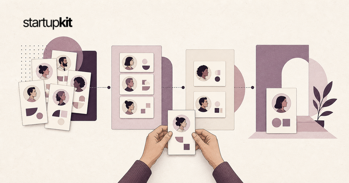
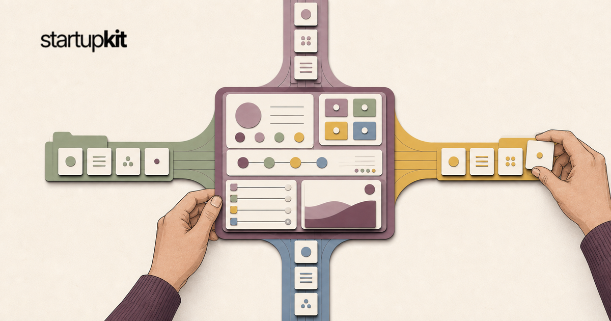
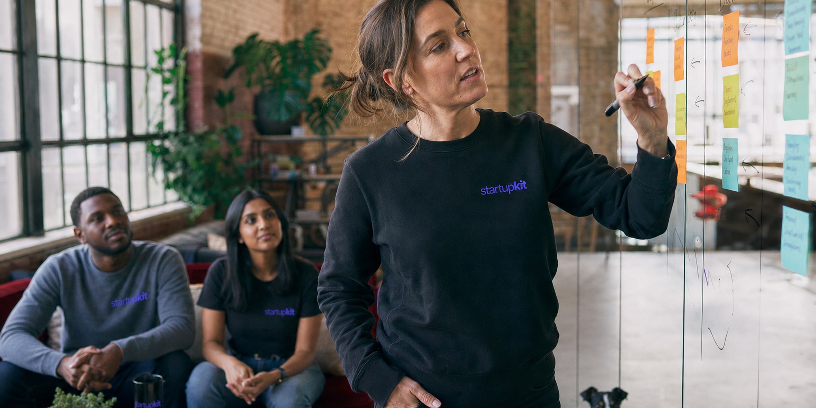
Two kinds of picture, each with one job. Social cards are paper cut. Blog covers are photographs.
Social cards
Paper cut on warm oatmeal paper, dusty mauve and deep plum layers, the black wordmark top left. Illustrated hands do a real task: hold a card, move a tile.

Blog photography
35mm editorial film, people wearing startupkit merch, warm light, the logo small and on a shirt rather than on the wall.






Do
- Hands in plum knit sleeves doing a real task
- Oatmeal paper, dusty mauve and deep plum layers, fine grain
- The black wordmark top left, nothing else written
Don't
- Decorative floating hands, or a handshake
- Invented interface text or fake screenshots
- The logo as the subject of a photo
Voice
Five rules for anyone writing about Kit. They are the same rules the site is written by.
- Name the artifact, not the benefit
- Point at a thing that exists. A link, a ledger row, a CSV column, a running clock.
- Concede one true limit
- One sentence a competitor would refuse to publish buys credibility for every other line.
- Outsider first
- Start with the person who has no login. The candidate, the researcher, the trainee, the auditor.
- No category nouns
- No platform, solution, seamless, streamline, robust, leverage, end-to-end, powerful, AI-powered.
- One sentence, one job
- Cut the clause that restates the one before it. Sentence case, always.
Naming
Write
- Kit, in sentences
- startupkit, where one word must find us (startupkit.app, @StartupKit_app)
- startupkit, lowercase, in the wordmark
Never
- Startup Kit
- KIT
- Kit.app
- StartupKit in a sentence
For agents
The same page as Markdown, every hex value and font setting included. Point an agent at it instead of describing the brand by hand. /brand/llms.txt answers the same file.
A prompt to paste
Read https://startupkit.app/brand.md and use the startupkit wordmark, colours and type exactly as documented there.
The startupkit wordmark and mark identify Kit. Use them to refer to Kit, not to suggest Kit endorses your product.